• Skip to main content
  • Skip to secondary menu
  • Skip to primary sidebar

NevBlog

Neville's Digital Surrogate Brain

  • Home
  • About
  • Goals
  • Podcast
  • Timeline Viewer
  • Contact
  • Random Article

Uncategorized

Improving HoR – Day 10 – Seasonal Stuff

April 18, 2008 by Neville

I spoke about getting seasonal a few days ago, so to take some action on that I’ve created the HouseOfRave 4th of July section

This section is the second to be added under my recently created “Seasonal” section. I’ve started populating the section with new products my supplier carries, I’ll add 5 or 10 products per day. A lot of the existing products I carry also go in this section, so it shouldn’t take very long to populate it.

So for today I made the 4th of July section, added some products, created the banner and added it to the seasonal section.

Improving HoR – Day 5 – HackerSafe Symbol

April 13, 2008 by Neville

A nice guy called me out of the blue one day, and did his sales pitch. It was good, I had been thinking about, so I took the bait and signed up.

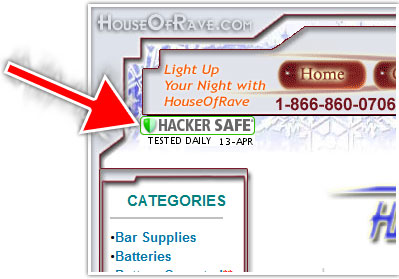
He was selling the HackerSafe logo occasionally seen on larger websites, it looks like this:

He got me to sign up for a $187/month service plus setup fee on a business that costs a total of $350/month to run. Must have been a damn good sales pitch!

Anyhow, I’m on a cost reduction/improvement phase for House Of Rave, so right now I can’t justify DOUBLING my monthly expenses to put up that logo. Kind of a mistake to sign up at this point….despite the wonders they claim the logo can do. I do like having the logo there, but the numbers simply don’t work in my favor:

They gave me a free trial period, but so far I haven’t seen any direct effect on sales. I’m still skeptical that simply showing this logo can increase sales (on a website this small). Rather at this point in HouseOfRave’s life….product selection, improved usability etc. would be more effective at increasing sales. For a small business like HoR, I just don’t think the HackerSafe logo is right at this time.

Now maybe if it were something reasonable like $50/month….

You signed up!

February 6, 2008 by Neville

Cool, you’re signed up The Neville Letters.

It’s gonna kick ass.

Me (or one of the other monkeys around here) will put your 1st letter in the mail.  It might be an envelope, or it might be a package.  WHO KNOWS!!

But you’re all signed up now.

Lemme know how you like it.
-Neville

nevmed@gmail.com
713.301.1546

Review of Detailed Image

January 14, 2008 by Neville

I don’t like many blogs but one of the few I regularly read is Adam McFarland’s. I particularly enjoy his blog because he’s about my age and does mainly web related businesses, so I can definitely relate.

Adam and 3 other guys (who also each own small businesses) formed a company called Pure Adapt in which they all pool their talents. Through a collaborative effort they’ve managed to take George’s online business Detailed Image to a whole new level and it’s now one of Pure Adapt’s most promising businesses. Detailed Image sells everything related to high-end auto detailing like car wax, paint buffers, leather cleaners etc. If it makes your car look good, DI probably has it.

I like Detailed Image as a business because it gets EXTREMELY high conversion rate of orders per customer. So if Detailed Image only gets less than 50 visits a day, they’ll still make 10 or more orders from that. One of my businesses HouseOfRave is the exact opposite. I get tons of traffic but low order rates. So I may get 2,000 visitors per day, but only 10 orders. They do this by staying very active in auto-detailing forums and adding lots of content to them. People are much more likely to buy stuff recommended by an active member of the forum.

This post was completely un-asked for by the guys who run it, but here is my review/impressions/suggestions for Detailed Image.com:

1.) Left Navigation.
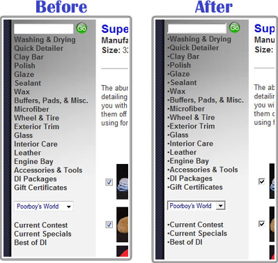
It reminds me of one of those standard OScommerce menus. I’d suggest putting some bullet points to tidy it up:

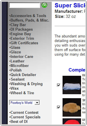
Maybe even alphebetize it:


2.) Product Image Location.
No need to change this, but I was definitely confused when viewing products. I browsed through a couple of items and thought, “Why don’t they have product photos?”

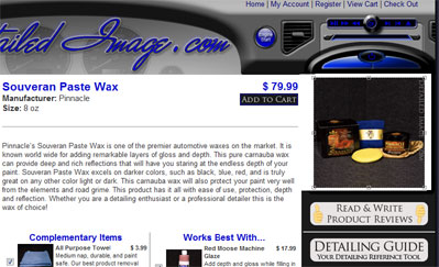
They’ve integrated the product photos into the side bar which is made to look like a GPS navigation system on a dashboard, but when browsing the web your brain generally separates the information in the side navigation bars from the main content. Even now, I still look at the site and forget each product has a picture.

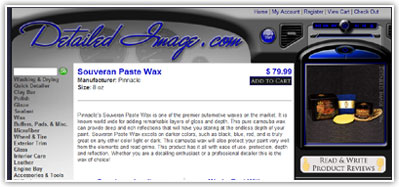
This isn’t really a problem, but a simple fix which could help a not-so-astute person like me is integrating the picture into the whitespace of the main content. This gives the effect of the product picture being a “part of” the main content instead of separated from it. Something like this:

Of course this particular example doesn’t fit into the whole “dashboard theme” very well.

3.) Shopping Cart Upgrade System.
Adam has been talking about how he’s completely revamped the shopping cart system for the site. It’s AWESOME! Instead of making someone go through the site and ADD small ancillary items to the cart individually, it automatically adds related items for you. This way when you UNCHECK items in your cart, you feel “Well, I will need one of those…” and keep it there. This equals larger orders.

Adam mentioned this feature has effectively DOUBLED the dollar amount of each order. Doubling income overnight? I’d say that’s one highly successful modification!

4.) More videos and before/after pictures.
I’ve seen some really nice before/after pictures George has posted in various forums. Some of them were so convincing they had me nearly buying $100+ worth of stuff from DI! However I can’t readily find any links to those highly convincing posts from the website. It would be nice if DI had a small section of before & after pictures of cars with different colors. I drive a black GS 300, and when I saw some before/after pictures of a black Infinity G35 during a detailing, I was VERY close to buying everything in the article. The key was seeing how good my color of paint could look when properly cleaned and polished.

The video of a buffer you guys recently posted is a great addition to the site. I never would dream of buying an expensive buffer had I not seen that video!

That’s all I’ve got for now, great job with the site guys. I can’t wait to see it grow in the coming years!

Jelly: A Funny Name for Co-Working

December 3, 2007 by Neville

I love this idea, and can see this being quite a big thing in a very short amount of time: Jelly.

It’s basically a funny name for co-working. This means a bunch of people gather in the same place to do their own individual work. It can be at a pre-arranged house, coffee shop or the like.

Here in Austin a guy named Dusty took the liberty to simply create a Wiki page on the Jelly website, and boom! The first Jelly Austin meeting had 20+ people come by the coffee shop to “Work Jelly.” Keep in mind that was without any real external advertising. By the third meeting, there was already a sponsor which donated some free food. Off to a great start!

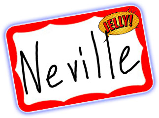
The guy who kicked off the Jelly Austin took the liberty of making some nametags for everyone which always helps lighten the mood and encourages more interaction (and saves you from the moments where you forgot someone’s name after 5 minutes)!

I like this concept a lot because I do almost all my work from a computer. All I need is a power cord, wireless internet and I’m in business. Since I work at home much of the day, it’s nice to work around a bunch of people every once in a while.

I sometimes spend time socializing when I should be working, but that’s what this Jelly thing is all about! You never know who you could meet there.

If you work at home quite often or just want to work with a different set of people every once in a while, I suggest you give Jelly a try. If there’s not one in your area, I strongly encourage you to start one!

The TED Site is Awesome

October 12, 2007 by Neville

There’s not many sites (particularly blogs) that I’ve found which consistently put out great material that I enjoy, but I’ve gotta say, https://www.ted.com/ has been doing a great job for the month I’ve been reading it.

I’ve never previously heard about it, but there’s a big conference held every year in Monterey, CA. called TED (Thinking, Entertainment, Design) with different speakers, guests yadda yadda…..but this conference has some of the most genuinely interesting stuff I’ve seen, and on a wide scale of subjects.

I keep a track of the TED Blog everyday, and would highly suggest checking out the ridiculously interesting TED Video Archive which contains some pretty amazing speeches by some pretty amazing people. They are each almost 20 minutes long, so I watch about one a day. I’m very impressed at the professional level these speeches have been filmed, so it’s like you’re at the speech itself.

Just thought I’d share!

Donate Buttons On Sites

October 11, 2007 by Neville

I’ll admittedly say I’ve downloaded way more than my fair share of illegal copies of software many, many times. Even HouseOfRave.com was originally built with a piece of software which I downloaded the demo then cracked the serial number during high school.

Not that this would solve the solution, but it would be nice if companies had small “Donate” buttons on their sites somewhere, much like shareware sites have. I would love to send $100 bucks or so to Adobe to thank them for their software I’ve used for so many years, but there’s currently no good way of doing this.

Not that $100 makes up for the price of the software, but at least it’s something I can afford and would be willing to send. Perhaps companies should setup these “Donate” accounts to where the company takes 15% of the pot, and the rest is somehow divided up to the developers. This would be like a virtual “Tip Jar” for the software developers.


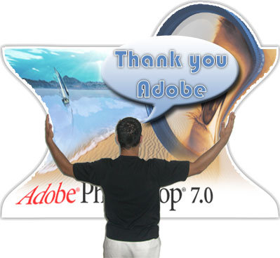
Pictured: Me giving Photoshop a hug.

When I was in high school and college there was NO WAY on earth I would pay for software. This was especially true for things like Adobe Photoshop which cost well over $1,000 to legitimately buy, but are also extremely easy to download for free from various sources.

From what I know about companies like Microsoft and Adobe is they make a majority of their money from businesses that must legitimately buy their software. They make much more here than in the individual consumer market.

So suppose one day when (if) I grow up, I have some sort of firm that deals with graphic design in some way and I eventually have to buy software to support this. My most logical choice will be an Adobe product since I’ve happily used their products for years with great satisfaction.

However right now it almost seems illogical for me to pay $1,000+ for the latest version of Photoshop when I can so easily go to mininova.org or some other BitTorrent site and download a full version completely gratis.

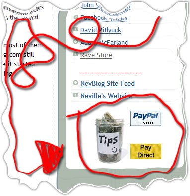
A while ago I put a little inconspicuous tip jar on NevBlog on the bottom-right navigation bar…

…and its actually got a couple of donations! Perhaps I should put one on HouseOfRave too in case someone enjoys the free videos or pictures, would like to send some money, but doesn’t necessarily want to buy anything.

—————————————

Speaking of these little virtual tip jars, I always thought they can be used as an interesting way to get a bloggers attention (like Steve Pavlina or some other big dog blog). You could send them a series of small denomination donations: $1 the first day, $2 the next day, $3 the next day….just to mess with them :-)

Interested In eBooks

October 7, 2007 by Neville

Tim Sykes’ Book – It’s Actually Good

October 2, 2007 by Neville

As I got his first rough-draft book for reviewing in the mail, I almost threw it in the trash like I do most of the promotional books I get. They’re usually something along the lines of “Make Millions Without Lifting A Finger” or some equally outrageous (yet unrealistic) title.

Tim’s book “An American Hedge Fund: How I Made $2 Million As A Stock Operator & Created A Hedge Fund” caught my eye because of the title and the fact that he is only two years older than I am (he is 26 now).

I started to simply skim through the book, but to my surprise it was actually quite an interesting read! His book described how he would work out of his dorm room in college (which sounded very familiar to me) and trade stocks. I did this too once, although not near to the level he got. Sometimes he would gain as much as $130,000 in ONE DAY!! Needless to say I was very enthralled by the story:

From $12,000 in Bar Mitzvah money, Tim turned that into about $1.65 MILLION in less than 3 years! I was a little skeptical about him claiming to be a big shot money guru, because he traded during volatile times in the stock market. Impressive none-the-less, but I feel a truly seasoned money professional can make money throughout every type of stock market (like TheKirkReport.com), but Tim wasn’t even old enough to have experienced more than 1 or 2 types of markets.

Surprisingly he didn’t tout himself as a big-shot money guy, but it shows the reader about his absolutely risky trading habits which luckily paid off for him. Of course turning such little money into so much money still takes lots of skill.

While I was in New York I got a chance to meet up with Tim, and he’s quite the cool character! We met up at the really slick W Hotel bar called WetBar (sorry, I forgot to get a picture) and started talking about all his ventures. Really cool guy. He now has his own web series with his own camera crew and everything on MSN Video and TheStreet.com, plus has been on CNBC many times, interviewed cool people like Richard Branson and has done some very interesting skits to teach people about stocks.

I told him he was going to be the Bill Nye the Science Guy of stocks one day because he makes his lessons informative yet interesting at the same time.

—————————–

One of the other things that fascinated me about this kid was instead of him publishing his book through a big publishing house, he decided to start his own publishing company to release his book. This caught my attention, because I love it when people embark upon an industry they know little to nothing about and succeed in it. So instead of going with a big publishing house and getting very small returns per-book, he can go through himself (and Amazon.com) and make a large sum per book. I love it!

If you haven’t heard about Tim Sykes by now, I have a feeling you’ll be hearing a lot more about him soon. I do know one thing though, his personality is a love-him or hate-him type. We were supposed to attend the Trader Monthly 30 Under 30 party while I was in New York, and Tim actually got DIS-INVITED!!! HA!!

Apparently the previous year he showed up in a bath robe to the party (which I think is completely hilarious and a nice break from the stuffy suits that always show up).

Check him out.

Consistency In Brand Image

September 5, 2007 by Neville

Although I rarely watch CNBC anymore, I like when they profile big companies like WalMart. Today I saw a profile about the start and growth of McDonalds.

It showed how the McDonald brothers had a small chain of restaurants until Ray Croc (a milkshake machine salesman of all things) bought them out. He started replicating the McDonalds business model all over the nation then globe, but the thing he was fanatical about was consistency.

He wanted all McDonald’s stores to have a proper look and feel to them to make customers familiar with them, therefore more inclined to buy from them. I’m not selling hamburgers, but having a “put together” business to make people feel comfortable is a good idea for any business.

This somehow ties into my recent plan to start making HouseOfRave more consistent and “put together” to appear more professional. I’ve started working with a more professional supplier, and therefore I need to make the site more professional and consistent. This doesn’t mean necessarily re-designing the site, but just making everything more congruent.

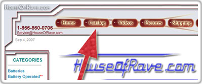
I went from somehow watching a special about McDonalds (which I then proceeded to eat at) to snooping around my own website trying to view it from a brand new visitors perspective. One of the first things I noticed was the 2nd top-level navigation menu button “Catalog” was horribly designed and outdated by several YEARS.

This is a highly clicked page, and some of the category links on this page had dead links, and many of them have been changed or removed over the years. This could easily turn a potential customer away. I immediately started working on this and cranked out 18 custom category images. I use Photoshop all the time, so this went relatively quick..but was very boring. Now instead of writing “Battery Operated Section” and including a small 75×75 pixel product image from that category, it now has a proper image associated with it. So the battery operated section of the catalog has this image:

It has a more congruent feel with the website and more thoroughly conveys what that section contains. A portion of the images used were actually taken by me in previous product photo shoots. For example, the only non-mine image above are those finger lights, that’s just a standard manufacturers picture.

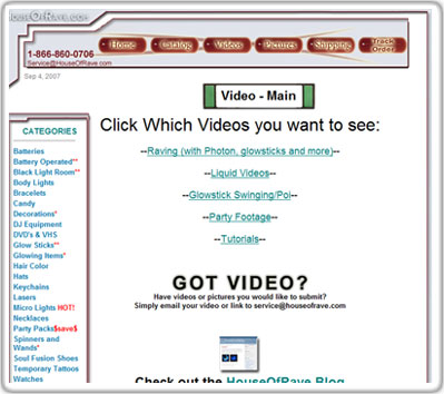
Another thing I quickly noticed on the top menu bar was another high-traffic page which has been neglected for some time. The video section leads to a page that looks like this:

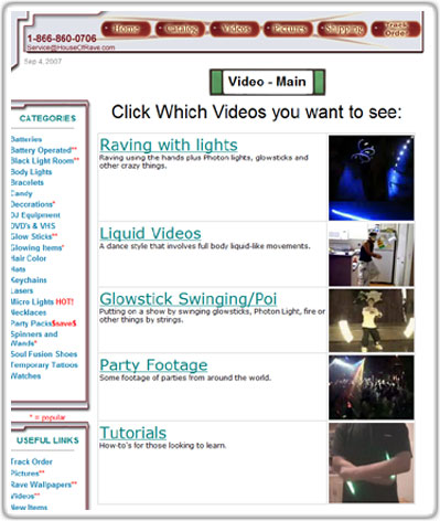
It’s meant as the video landing page where you can select between five different types of videos. This section has been around a long time and has proved to be pretty popular, so I figured I should at least jazz it up with a few small images. So I quickly added a few and it looks like this now:

I’m not 100% happy with that look, but it’s slightly more engaging now.

So these are just two small changes I’ve made to make the site look more congruent and put together. The ultimate goal is not to have the best designed site around, but to make potential customers feel comfortable enough to order from it.

Since I see the site everyday from the owners view, I focus on different things than customers. I need to start patrolling around the site more often with a different perspective to catch other obvious errors and areas that could use improvement. That will be my main objective for HouseOfRave this September.

Feel free to let me know via comment or personal email if you catch other obvious errors!

  • « Go to Previous Page
  • Go to page 1
  • Interim pages omitted …
  • Go to page 26
  • Go to page 27
  • Go to page 28
  • Go to page 29
  • Go to page 30
  • Interim pages omitted …
  • Go to page 41
  • Go to Next Page »

Primary Sidebar

Hi I'm Neville. This is my personal website. More…

Follow Along:

✏️ My Copywriting Blog
📂 My Swipe File Collection
▶️ YouTube Channel
🐦 Twitter
🌇 Instagram

Some Articles:

✏️ To-do list hack
✏️ The Lottery Experiment
✏️ Curb painting for profit
✏️ Illegal to write on money?
✏️ How to crash a party
✏️ Why Facebook Sued Me
✏️ Bottled Water Experiment
✏️ How House of Rave Works
✏️ Copywriting courses & books
✏️ Learning to backflip
✏️ Death Calculator
✏️ The purpose of life
✏️ Spray painted some shoes
✏️ Previous months goals
✏️ Have a reading party
✏️ Random article

The Archives:

  • 2025: J F M A M J J A S O N D
  • 2024: J F M A M J J A S O N D
  • 2023: J F M A M J J A S O N D
  • 2022: J F M A M J J A S O N D
  • 2021: J F M A M J J A S O N D
  • 2020: J F M A M J J A S O N D
  • 2019: J F M A M J J A S O N D
  • 2018: J F M A M J J A S O N D
  • 2017: J F M A M J J A S O N D
  • 2016: J F M A M J J A S O N D
  • 2015: J F M A M J J A S O N D
  • 2014: J F M A M J J A S O N D
  • 2013: J F M A M J J A S O N D
  • 2012: J F M A M J J A S O N D
  • 2011: J F M A M J J A S O N D
  • 2010: J F M A M J J A S O N D
  • 2009: J F M A M J J A S O N D
  • 2008: J F M A M J J A S O N D
  • 2007: J F M A M J J A S O N D
  • 2006: J F M A M J J A S O N D
  • 2005: J F M A M J J A S O N D
  • 2004: J F M A M J J A S O N D

Copyright © 2025 Neville Medhora